
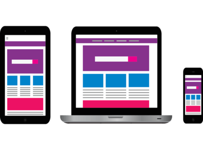
There are many different ways to search for and view information online. Whether it be on a desktop, mobile device, or tablet, the information should remain the same and provide an equally great user experience – no matter which device is being used. Google’s Internal Data states that in today’s market, 60% of automotive searches come from a mobile device (Google Internal Data, 2017.) This is where having an adaptive or responsive website can come in handy and play a huge role in determining whether or not your store succeeds. According to J.D. Power, more than half (56%) of automotive internet shoppers conduct research on a mobile device (J.D. Power, 2017). In this article, I will explain the differences between adaptive and responsive sites and how choosing the right website for your dealership can change your website, improve user experience, and ultimately, increase revenue.
Adaptive Websites
Adaptive websites allow your site’s layout to change depending on the user’s viewing device. This means that for every screen type (mobile, desktop, tablet), you will need a separate site that displays on each screen size and resolution. This website type offers many more customizable options and really allows you to get creative. One of the drawbacks to an adaptive website is that it is time-consuming and can be difficult if you are new to web development. One of the biggest pros of an adaptive website is that since each device requires its own page layout, you can tailor your site to display what you want and how you want it. For example, since mobile phone screens are much smaller than a desktop, you may only want to display the most important information on your mobile site. By ensuring your site is optimized for mobile, you are giving your potential customers exactly what they want, when they want it.
Responsive Websites
There is essentially only one key difference between a responsive and an adaptive website. With an adaptive website, you need multiple pages created for multiple device sizes. With a responsive website, you only need one website page. This means that you don’t need to have an individual desktop site, mobile site, and tablet site. No matter which device you are using to look at your company’s website, the content, layout, images, and other website content will “respond” to the device you are using! You no longer have to “pinch and zoom” to see an image or scroll horizontally to finish reading that article. This makes it easier to change content on your site, create new pages, or simply change the entire layout. By ensuring that your site functions seamlessly, your users will have a much better experience which directly translates to more sales opportunities, higher conversions, and increased revenue.
Interested in hearing more information and learning how to best make sure your website is optimized? Contact Aronson Advertising today at 847-297-1700 to see how we can help improve your business!