

In the digital marketing space, there are many important factors that can impact the success of your SEO & PPC strategies. Your page could have all the target keywords you’re looking for, but if the user experience (UX) is poor then your customer will bounce. Your landing pages, in many cases, define how a prospective customer will see your company. Make sure your user’s first impression is a good one with the following five simple design changes you can make to improve the look and functionality of your landing pages.
1. Optimize Your Images
One of the biggest factors that affects bounce rate is slow page speed. Large images will negatively impact your page speed. This is one of the simplest ways to impact your UX. If you are adding images to your page, be sure to first size them down to the height and width you will need them to be on desktop. If your content width on your page is 1000 pixels, scale the width down to 1000 pixels. Also try to use JPG files whenever possible. If you need to have an image with a transparent background, then you would want to use a PNG. But if not, always use a JPG. You can even scale down the size of the file by using the Squoosh for JPGs or Tiny PNG.
2. Add Color
If your website is only using one color, you may not be utilizing all the tools that could help your page stand out. Adding in another color is a great way to highlight the important features on your landing page and draw the user’s eye to where you want it to go. There is plenty of research on the study of color psychology, and while some colors may be associated with certain ideas, no specific color will make all of your users compelled to buy your product. However, making the color of a button or product different from the rest of the page is a really easy way to pull the user’s attention to that part of the page.
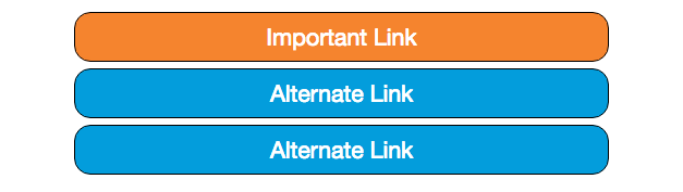
When participants were presented with a group of similar items, they are more likely to notice and remember the one item that is distinctly different. This is called the von Restorff effect, also known as the isolation effect. It is important to keep in mind that more colors does not equal more distinctive. Choose one color that represents your brand and does not clash with the current color scheme. Using too many colors will make the whole page difficult to read, and over use of your added color defeats the purpose.
3. Be Predictable
This is not a phrase that you may hear often, but it can make the functionality of your site much easier for your user. Users have a certain expectation that has been imprinted on them by other websites. They will expect to find basic elements in similar places. If you look at the product details page on Amazon it is set up very similar to eBay and even to the vehicle details page on most car dealerships; Image on the left, information to the right and buttons just below that.
Once you have those key elements established, you can design your unique page layout from there. Be sure to replicate the same layouts across all of the pages on your site. If a user gets comfortable navigating one page on your site, they should be able to navigate similar pages resulting in more engagement with your page. The buttons and information they need should be in the same spot on the second page as it is on the first. Repeating the same design makes it easy for to find the Call-to-Actions (CTAs) that they are interested in.
When choosing the verbiage for your CTAs, many SEOs tend to focus on something that stands out and entices the user to click. Sometimes they may make the mistake of not being transparent enough with the user. Be sure to make it clear where the buttons on your site will go. If you have a click to call on your site, make it obvious that users will be calling in the CTA. Easy ways to do this is to add the word call, or use a simple phone icon in the anchor text.
4. Utilize White Space
White space, also known as negative space, is a portion of the page that has no elements and has been left blank. Adding some space between sections of your content is an extremely easy UX change that will greatly benefit the readability of a page. No one wants to look at a large, disorganized block of text. Adding in some margins or padding into your web design will give your content a spacious feel and help the sections of your content stand out, helping the user better understand what they are reading. Whitespace can give your design a more simple, clean and elegant feel. There’s a reason that the homepage of Google looks the way it does.

Just like adding colors, over use of white space can have the opposite effect. When adding white space be sure to focus on spacing out elements on your page just enough to make them feel like they are reading a separate section of your content. Otherwise, you will have empty space on you page that look like they are missing elements. Additional whitespace causes additional scrolling, so be sure that you are still keeping necessary information and elements above the fold.
5. Make Sure Your Content is Easy To Read
Mobile devices are taking over internet traffic and have been for a while. When a user is on a mobile device, they are using a smaller screen and are generally more likely to be in a hurry to find specific information. It is important that your content is as readable as possible. Begin with making sure that your font choice and size are the best possible options. Many sites will likely have Arial, Times New Roman, or something similar. The minimum font-size should be 12px so that it is readable on laptops, desktops & phones, but using slightly larger font is suggested.
Users are also interested in skimming the content to find the information they were originally looking for. Make sure they can easily find the answers they need by using:
- Clear, concise H2s
- Links to other sections in your content
- Information Tables
- Lists
- Use drop downs when necessary to reduce the length of your page
Implementing a few of these changes is not going to drastically change the way your customer interact with your business, but they are simple solutions to help improve your users experience. Your website can shape a person’s perception of your website, so make sure your design matches what you want people to think about your brand. The digital team at Aronson Advertising has the experience to align your websites looks with your brand. Contact our agency or give us a call at 847-297-1700 to get started!