
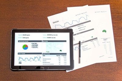
In the marketing environment, the clients you serve are going to need a clear understanding of the service that you can provide for them. When the client you are working for has an objective to sell their products and have little understanding of the marketing environment that they are selling to, they need to have a clear visualization of the services that you are providing for better business. That is why data visualization is crucial to influencing your clients. Making sure that you are clean, consistent, and adding the necessary elements to your visuals can increase your digital marketing potential.
Best Practices for Data Visualization
It starts with understanding the right visual you are going to use when presenting data. You can have multiple selections when it comes to the type of visual you want to use to be effective. You have to ask yourself what you are comparing, what trends you are showing, or the relationships you are trying to make.
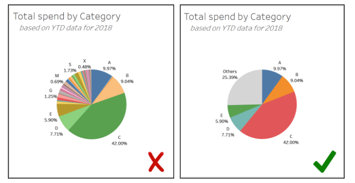
When it comes to the amount of data you are presenting, you want to make sure it is as effective as possible without cluttering or overflowing a chart, eliminating trivial or unimportant data that might mask the crucial points you’re trying to make. You want your audience to understand the material presented in front of them, and you definitely do not want to confuse them. You want them to ask questions out of curiosity, not confusion.
Example of cluttering your data:
Proper labeling is crucial for making presentable reports. If unsure about which variable to put on which axis on a particular graph, the x-axis is the cause, and the y-axis is the effect. You also do not want to distort your dataset by not formatting your graphs properly. For instance, in a line graph, you can distort the length of the graph to show a more significant increase or decrease based on the parameters you select. Zoom out, paint a better picture, and clarify what is needed to make appropriate improvements. Lastly, the inclusion of colors should add more information to the visuals rather than adding redundancy or distraction.
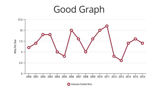
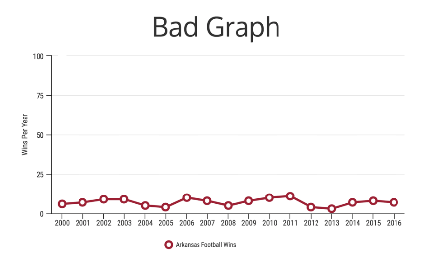
The graphs above show a simple example of understanding your graph’s parameters and making sure that they highlight more important fluctuations in the data, rather than understating them with poor labels.
NinjaCat
A relatively new resource we have been using is called NinjaCat. This tool helps us manage client data through multiple mediums in one seamless process. A daunting task when reporting on data from multiple mediums is the time it takes to compile and report the appropriate data for the client’s knowledge. With NinjaCat, you can seamlessly connect multiple channels of data sources through cross-channel data aggregation, data mixing, and design tools that make presenting data easy and effective. In turn, that time can be better utilized on creating better campaigns, and even more efficient reports.
What is the narrative?
Any data set presented, no matter how large it is, must tell a story. You can have a very high volume of data for a given dataset, but there has to be a point that the data is representing. For instance, a survey is taken from multiple sample sets from different dealerships. You can get all of their demographics, all of their sales, all of their locations, etc. but the story you are telling has to make sense on the visuals you are showing. What is the data not showing you? What conclusions can you draw based on what is not being shown? What about the date range is influencing the data? Are their outside forces influencing what could be happening? Give your audience perspective to help influence their thoughts. All of these factors must be considered when explaining fluctuations in datasets.
In the world of digital marketing, conveying your ideas and services to your clientele efficiently is crucial for success, especially when it comes to individuals who have little grasp on the tools you are using. Paint pictures in the minds of your clients, show a clear image of the message you are conveying, and make it easy for everyone to understand what needs to be done when moving forward. In this case, less is better and it is turning large chunks of data into clear, easy to digest snapshots. Understanding effective methods for data visualization will only help your business grow and look favorably upon consumers.
If you’re interested in how to enhance your data visualization as well as the additional digital marketing services available at Aronson Advertising, reach out to our team of digital experts by calling 847-297-1700 today!